%20(1).png)
In the dynamic world of web development, responsive and user-friendly components have never been more important. One of these is a filter component that enables web users to quickly filter user interface (UI) and data elements and display only relevant fields. The challenge is creating a filter component that can fit any screen size.
This article will demonstrate how to implement a responsive filter component using React. The tutorial explains how developers can build flexible filters into their web applications.
Table of Contents
- Best practices for building a responsive React Filter component user interface
- How to build a responsive React filter component: A step-by-step guide
- Building a button controlling the React filter component
- Designing the React filter component button
- Implementing modals for mobile devices
- Putting everything together
- Conclusion
Best Practices for Building a Responsive React Filter Component User Interface
In modern UI, elements are made to be dynamic and placed according to user convenience. The components must respond to changes in window and screen sizes. Ideal implementation and placement of the elements lead to a cleaner layout and a smoother user experience (UX).
Certain best practices must be followed while building a responsive React filter. The filter component should adapt seamlessly to different screen sizes and changing aspect ratios. Different filter types must be used for different situations. Dropdowns are ideal for desktop designs as they are space-efficient and easy to navigate.
On mobile devices, touch-friendly elements like modals and buttons are preferred to improve usability. Element placement must be such that they are easily reachable and readable, maintaining a tidy and responsive layout. This clean interface allows new and experienced users to interact with the filter component efficiently without any problem.
How to Build a Responsive React Filter Component: A Step-by-Step Guide
a). Set Up a React Project
To get started, set up a new React project using create-react-app:
npx create-react-app my-filter-app
my-filter-app could be any name for your React App.
Organize the folder structure as follows:
- src
- Components
- Card.js
- filterButton.js
- filterModal.js
- Data
- Data.js
- Components
b). Create the Filter Component
State Management
Begin by importing the necessary React hooks and your data in App.js:
import React, { useState, useEffect } from "react";
import Data from "./Data/Data";
import Card from "./components/Card";
import FilterButton from "./components/filterButton.js";
import FilterModal from "./components/modalFilter.js";
For Data.js we’ve used simple data in an array of objects representing menu items, each containing properties such as id, title, category, price, desc, and img. This data populates and filters the menu items displayed in the application.
import React from "react";


function Card({item}){
  return (
    <div className="container-fluid">
      <div className="row justify-content-center">
        {item.map((val) => (
          <div className="card m-3 p-3" style={{ width: "18rem", backgroundColor: "#303030" }} key={val.id}>
            <img src={val.img} alt={val.title} style={{border:"1px solid black", backgroundColor: "white"}} className="card-img-top" />
            <div className="card-body" style={{border:"1px solid black;", backgroundColor: "white"}}>
              <h5 className="card-title">
                {val.title} - {val.price}$
              </h5>
              <p className="card-text">{val.desc}</p>
            </div>
          </div>
        ))}
      </div>
    </div>
  );
};


export default Card;
The Card component displays a list of items as cards, with each card showing an image, title, price, and description. It receives an `item` prop, maps over it, and generates a styled card for each item.
Set up state management using the useState hook to manage the items to be displayed and a boolean to track if the device is mobile:
const [item, setItem] = useState(Data);
const [isMobile, setIsMobile] = useState(false);
Filtering Logic
Create a function to filter items based on their category:
const filterItems = (cat) => {
    const newItems = Data.filter((newVal) => newVal.category === cat);
    setItem(newItems);
  };
c). Responsive Design
Use the useEffect hook to add a resize event listener that updates the isMobile state based on the window width:
useEffect(() => {
    const handleResize = () => {
      setIsMobile(window.innerWidth <= 768);
    };


    window.addEventListener("resize", handleResize);
    handleResize();


    return () => window.removeEventListener("resize", handleResize);
  }, []);
useEffect hook effectively manages window resizing to update the isMobile state based on the window width. The handleResize function checks if the window width is 768 pixels or less, setting isMobile to true if so and false otherwise. By adding handleResize as a resize event listener and calling it initially, the state is accurately set upon mounting and resizing.
2. Building a Button Controlling the React Filter Component
a). Create a Filter Button
Create a FilterButton component that renders a dropdown menu with checkboxes for each category:
import React, { useState } from "react";
import Data from "../Data/Data";


const FilterButton = ({ menuItems, filterItems, setItem }) => {
  const [selectedItems, setSelectedItems] = useState(new Set());


  const handleCheckboxChange = (item) => {
    const newSelectedItems = new Set(selectedItems);
    if (newSelectedItems.has(item)) {
      newSelectedItems.delete(item);
    } else {
      newSelectedItems.add(item);
    }
    setSelectedItems(newSelectedItems);
    applyFilters(newSelectedItems);
  };
const applyFilters = (selectedItems) => {
    if (selectedItems.size === 0 || selectedItems.has("All")) {
      setItem(Data);
    } else {
      const newItems = Data.filter((newVal) => selectedItems.has(newVal.category));
      setItem(newItems);
    }
  };


  return (
    <div className="dropdown">
      <button
        className="btn btn-dark dropdown-toggle"
        style={{width:"125px"}}
        type="button"
        id="dropdownMenuButton"
        data-bs-toggle="dropdown"
        aria-expanded="false"
      >
        Filter
      </button>
      <ul className="dropdown-menu" aria-labelledby="dropdownMenuButton">
        {menuItems.map((val, id) => (
          <li key={id} className="dropdown-item">
            <div className="form-check">
              <input
                className="form-check-input"
                type="checkbox"
                id={`filter-${val}`}
                onChange={() => handleCheckboxChange(val)}
              />
              <label className="form-check-label" htmlFor={`filter-${val}`}>
                {val}
              </label>
            </div>
          </li>
        ))}
        <li className="dropdown-item">
          <div className="form-check">
            <input
              className="form-check-input"
              type="checkbox"
              id="filter-all"
              onChange={() => handleCheckboxChange("All")}
            />
            <label className="form-check-label" htmlFor="filter-all">
              All
            </label>
          </div>
        </li>
      </ul>
    </div>
  );
};


export default FilterButton;
This component provides a dropdown menu for filtering items by category. It maintains selectedItems state to track chosen categories. The handleCheckboxChange function toggles categories in selectedItems and calls applyFilters, which updates the displayed items based on the selected filters. The JSX structure includes a dropdown button and a list of checkboxes for each category, plus an "All" option to reset filters.
b). Button Interaction with Filter Logic
The FilterButton component utilizes event handlers to change the filter state. The filtering process is activated using the onClick event, which updates the selected items and filters the displayed data accordingly.
3. Designing the React Filter Component Button
a). Visual Appeal and Responsive Design
For button designing, we have used Bootstrap, a popular CSS framework that ensures a consistent and responsive design. In our React app, we have also used Bootstrap to design various components like Cards, Dropdown, and Modal.
Bootstrap also ensures responsiveness while maintaining the different aspects. For media queries, we have used functions in App.js that manage the change from desktop view to mobile and vice versa.
4. Implementing Modals for Mobile Devices
Modals will help produce filter interfaces for mobile devices that are full-screen and free from distractions.
a). Implementation
Create a FilterModal component using the Bootstrap modal component:
import React, { useState } from "react";
import Data from "../Data/Data.js";


const FilterModal = ({ menuItems, filterItems, setItem, Data }) => {
  const [selectedItems, setSelectedItems] = useState(new Set());


  const handleCheckboxChange = (item) => {
    const newSelectedItems = new Set(selectedItems);
    if (newSelectedItems.has(item)) {
      newSelectedItems.delete(item);
    } else {
      newSelectedItems.add(item);
    }
    setSelectedItems(newSelectedItems);
  };


  const applyFilters = () => {
    if (selectedItems.size === 0 || selectedItems.has("All")) {
      setItem(Data);
    } else {
      const newItems = Data.filter((newVal) => selectedItems.has(newVal.category));
      setItem(newItems);
    }
  };


  return (
    <div className="modal fade" id="filterModal" tabIndex="-1" aria-labelledby="filterModalLabel" aria-hidden="true">
      <div className="modal-dialog">
        <div className="modal-content">
          <div className="modal-header">
            <h5 className="modal-title" id="filterModalLabel">Filter</h5>
            <button type="button" className="btn-close" data-bs-dismiss="modal" aria-label="Close"></button>
          </div>
          <div className="modal-body">
            {menuItems.map((val, id) => (
              <div key={id} className="form-check">
                <input
                  className="form-check-input"
                  type="checkbox"
                  id={`filter-${val}`}
                  onChange={() => handleCheckboxChange(val)}
                />
                <label className="form-check-label" htmlFor={`filter-${val}`}>
                  {val}
                </label>
              </div>
            ))}
            <div className="form-check">
              <input
                className="form-check-input"
                type="checkbox"
                id="filter-all"
                onChange={() => handleCheckboxChange("All")}
              />
              <label className="form-check-label" htmlFor="filter-all">
                All
              </label>
            </div>
          </div>
          <div className="modal-footer">
            <button type="button" className="btn btn-secondary" data-bs-dismiss="modal">Close</button>
            <button
              type="button"
              className="btn btn-dark"
              data-bs-dismiss="modal"
              onClick={applyFilters}
            >
              Apply
            </button>
          </div>
        </div>
      </div>
    </div>
  );
};


export default FilterModal;
The modalFilter component enables users to categorize items according to their preferences using a modal with checkboxes. It manages selected categories with the selectedItems state. The handleCheckboxChange function toggles categories in selectedItems, while applyFilters updates the displayed items based on the selected filters. The JSX structure includes a modal with checkboxes for each category, a "Close" button, and an "Apply" button that triggers the filtering logic.
5. Putting Everything Together
To assemble the filter component, follow these steps:
- Set up the project and create folder structures.
- Build and style components.
- Add filtering logic and state management.
- Ensure responsiveness and accessibility on different devices.
Here is the complete App.js file:
import React, { useState, useEffect } from "react";
import Data from "./Data/Data";
import Card from "./components/Card";
import FilterButton from "./components/filterButton.js";
import FilterModal from "./components/modalFilter.js";


const App = () => {
  const [item, setItem] = useState(Data);
  const [isMobile, setIsMobile] = useState(false);
  const menuItems = [...new Set(Data.map((val) => val.category))];


  const filterItems = (cat) => {
    const newItems = Data.filter((newVal) => newVal.category === cat);
    setItem(newItems);
  };


  useEffect(() => {
    const handleResize = () => {
      setIsMobile(window.innerWidth <= 768);
    };


    window.addEventListener("resize", handleResize);
    handleResize(); // Initialize


    return () => window.removeEventListener("resize", handleResize);
  }, []);


  return (
    <div className="container-fluid">
      <div className="row">
        <h1 className="col-12 text-center my-3 fw-bold">Our Menu</h1>
        {isMobile ? (
          <>
            <button type="button" className="btn btn-dark m-3" data-bs-toggle="modal" data-bs-target="#filterModal">
              Filter
            </button>
            <FilterModal menuItems={menuItems} filterItems={filterItems} setItem={setItem} Data={Data} />
          </>
        ) : (
          <FilterButton menuItems={menuItems} filterItems={filterItems} setItem={setItem} Data={Data} />
        )}
      </div>
      <Card item={item} />
    </div>
  );
};


export default App;
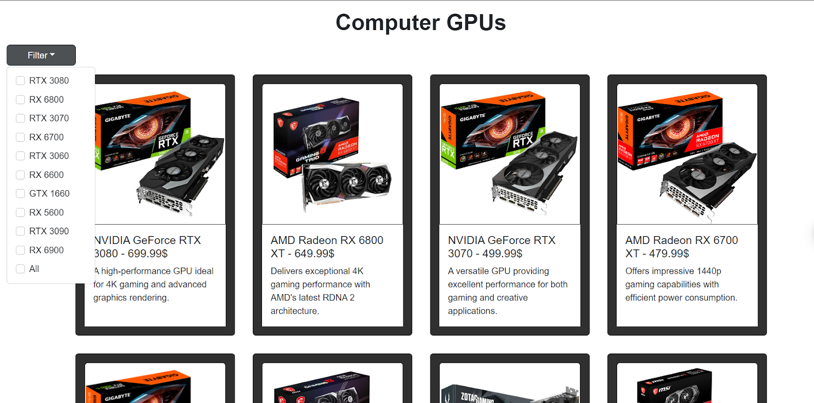
Here is the final view of our React app with the filter component in a desktop view. As we can see, there is a filter button, by clicking it, we can see all the filtering options in a dropdown.
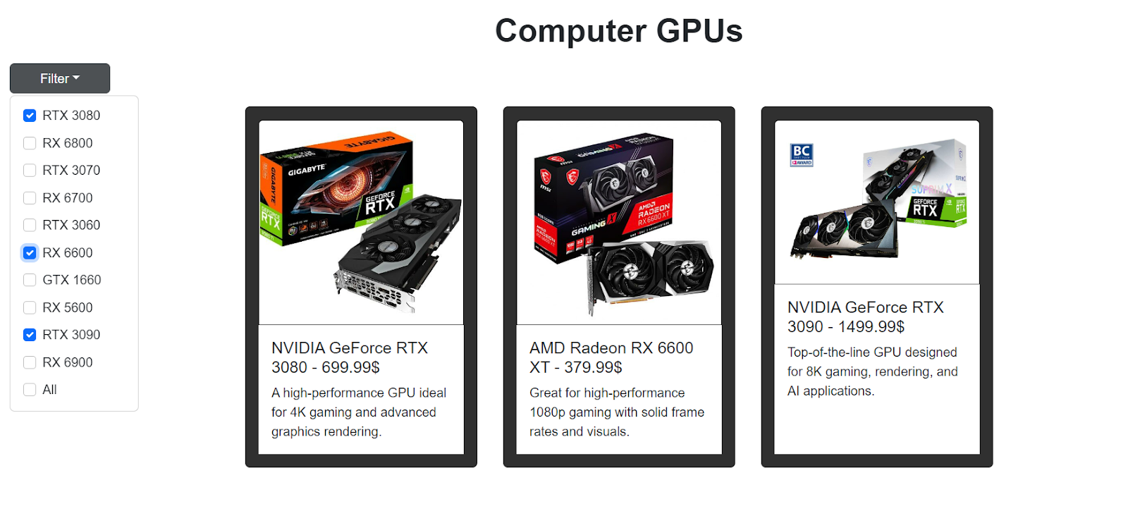
Here we have selected some of the items to be filtered out, and we can see that it is working just fine and showing us our desired items.
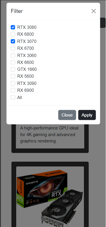
In the image above, we have opened our React app in a mobile view. The filter component button has opened a modal with all the filtering items. We have chosen two items to be filtered, and after clicking the apply button, the filter will apply to those items. Below is the image of the items that are filtered out.

Conclusion
Filter components allow users to easily navigate websites by filtering relevant elements. A dynamic filter component adapts its placement and size to changing screen sizes and provides a clean layout.
This blog covered the steps to make a responsive filter component with React. Creating an interface that is user-oriented and handling states through hooks such as useState or useEffect efficiently while ensuring compatibility with different devices. With the use of Bootstrap for designing purposes and modals, in addition to this approach, it becomes possible for developers to build better web applications that are both more available and captivating.
You may also be interested in:
Ember JS vs React JS: Comparing Javascript Technologies
React Developer Salary Outlook: The Complete Guide for 2025
How to Install React Helmet to Improve SEO for ReactJS Apps
React Native UIs: Build Responsive Mobile Apps for All Devices
More cost-effective than hiring in-house, with Nearshore Boost, our nearshore software development service, you can ensure your business stays competitive with an expanded team and a bigger global presence, you can be flexible as you respond to your customers’ needs.
Learn more about our services by booking a free consultation with us today!


